 MicrosoftPower Automate for desktop
Show the AI your task
Desktop automation by recording and narrating
AI Recorder lets people build a desktop automation by sharing their screen and talking through the task, like teaching a coworker.
I was the design lead for its redesign in Power Automate for desktop, focused on trust: what the recorder sees, and what the AI changes.
- Role
- Design lead
- Team
- PM, engineering, research, content
- Timeline
- 2024–2025
- Status
- Shipped
Overview
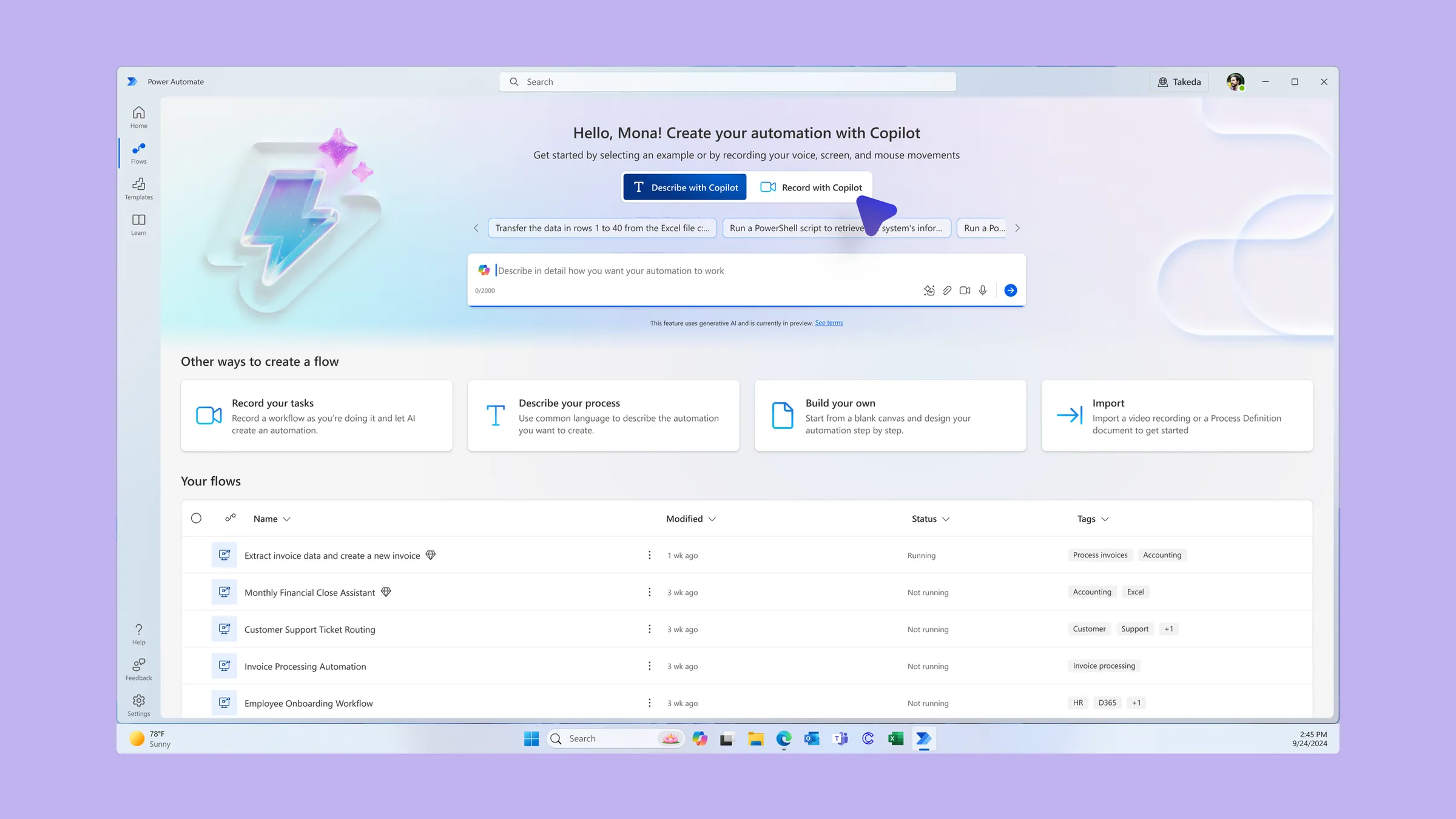
A new way to build automation, recorded on real work screens
Desktop automation has always been tedious to build. You either scripted every click, or used a recorder that copied your mouse and keyboard but missed the logic. AI Recorder changes the input. You share your screen, do the task, and explain it out loud like you’re teaching a coworker. The AI turns that into a desktop flow, with conditions and loops, that you can review and edit.
That created two new problems. People record their real work, in real apps, with real business data on screen, and send it to an AI. And the AI’s output isn’t perfectly predictable, while the apps it automates keep changing underneath it.
I led the redesign of the full recording experience. I ran the recorder’s first tenets-and-traps exercise, which turned a scattered list of concerns into clear design priorities, and partnered with research on the studies that mattered most for what came next. I designed an end-to-end vision that addressed the known problems and delivered sprint-sized pieces of it to engineering. I shared work with engineering before it was finished, so they could shape it instead of reacting to it.
People record their real work, with real business data on screen, and send it to an AI.
Trust
Making it obvious what the recorder can see
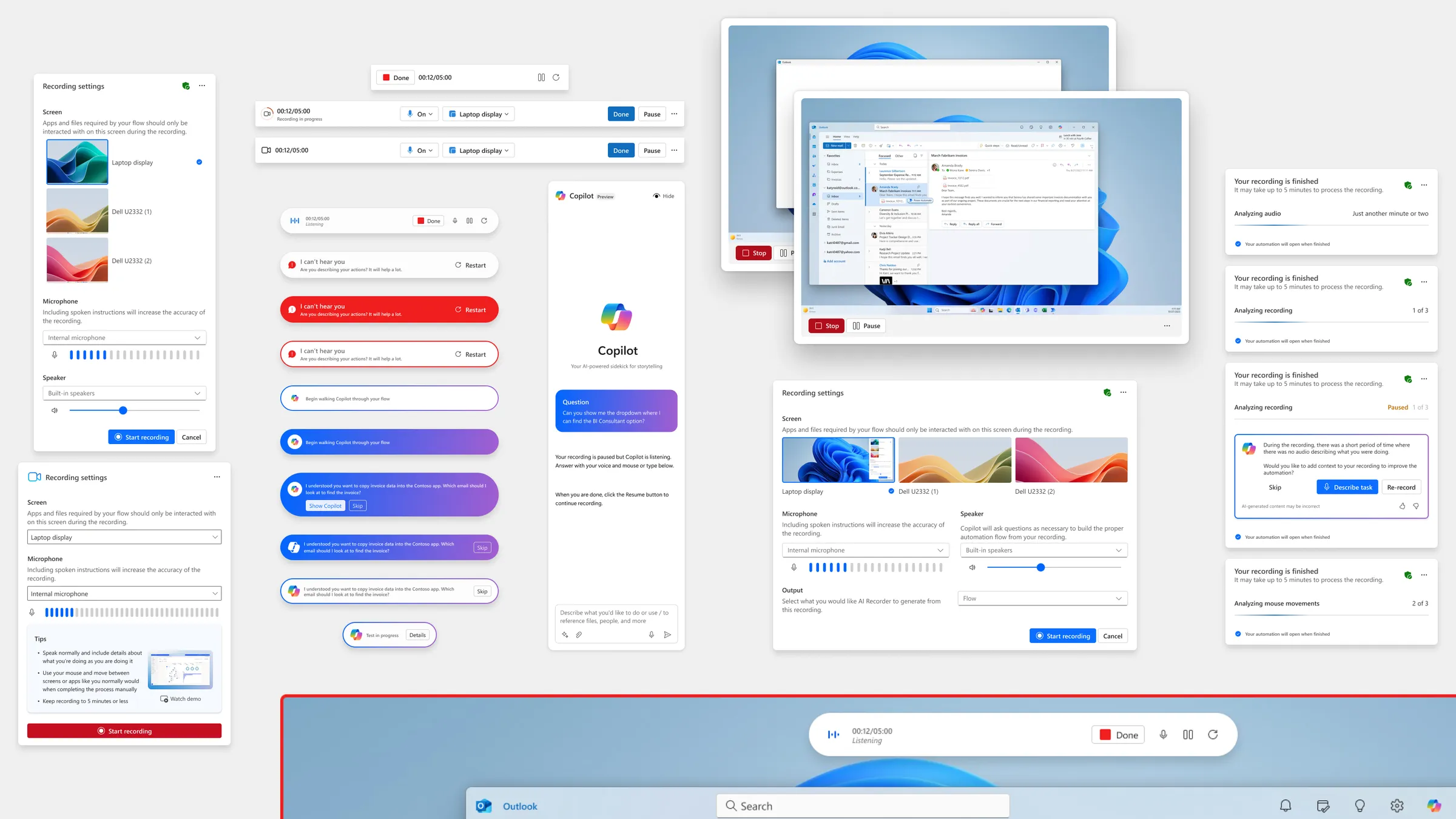
The recorder captures video of a screen, and most people doing this work have more than one. If it isn’t clear which screen is being recorded, someone can capture a customer record in one window while demonstrating a task in another.
I also caught a quieter version of the same problem. While working with content design on how to show error messages, I noticed an error could appear while sensitive data was on screen, and end up in the recording. Nobody had flagged it. I raised it, and it started a team conversation about setting expectations before someone hits record.
My decision was to make the recording target explicit at both ends: choose the screen before you start, and keep a clear, persistent signal on that screen while you record.
The tradeoff was one more step before recording, in a feature whose whole pitch is “just show it.” I thought it was worth it. A recorder people don’t trust with their screen is one they won’t use for real work.
That direction is reflected in what shipped. The recorder asks which monitor to record before you start, outlines it with a colored border while you record, and lets you restart or close without sending anything for processing.
A recorder people don’t trust with their screen is one they won’t use for real work.
Recovery
Letting AI repair a broken flow, with the maker’s approval
Desktop flows break when the apps under them change. A button moves or a field gets renamed, and the flow fails. Self-healing was part of the recorder’s promise from the start: the AI notices the change, suggests a fix, and the maker approves it.
The concept was set. The experience wasn’t. How does a maker find out something changed? How much do they need to read to trust the fix? And where should that moment happen?
I designed it as part of the flow experience itself, not a separate review step, and as a scalable pattern rather than a one-off screen: one consistent way to show a detected change, the suggested fix, and a clear approve or reject.
The tradeoff was speed. Applying fixes automatically would be faster. But a desktop flow acts on real systems, and a silent change is exactly what makes someone stop trusting automation. Approval cost a click and kept the maker in charge of their own flow.
That experience continues to inform similar work across the Power Automate for desktop design team.
Outcome
What shipped and what carried forward
- General availability: Record with Copilot is available in Power Automate for desktop.
- Trust: the recording target is explicit before and during every recording.
- Reuse: the recovery experience continues to inform similar work across the Power Automate for desktop design team.
- Direction: the tenets-and-traps priorities shaped what the team fixed first.
Looking back
Pair the vision with what can ship now
My end-to-end vision moved faster than engineering capacity. It did its job, because engineering could see where the design was heading, but not all of it got built. Next time I’d pair each part of the vision with the smallest version that could ship right away.