 ToptalBASE design system
From 54 text colors to one system
Toptal’s first design system
Toptal’s platform had grown for years without a shared system. Designers passed styles around in Google Drive, and engineers kept rebuilding UI that was similar but not the same.
As the team’s second UX designer, I started BASE and led it: principles, a Sketch library, React components with an engineer, and a site the whole company used.
- Role
- Project lead
- Team
- Design team, front-end engineer
- Timeline
- 2017–2019, remote, alongside Dell
- Status
- Shipped
Overview
A growing product with no shared system
Toptal connects companies with freelance engineers and designers. Its platform had barely changed since 2010, and updates were made in isolation, one feature at a time. It looked outdated, and the inconsistencies ran deep: designers shared a handful of styles through Google Drive, and nothing guaranteed that a design had a matching counterpart in code.
I joined as the team’s second UX designer. After weeks of shadowing calls with users and reading the design and engineering channels, the pattern was clear. Engineers got designs that were similar but not exact. Designers kept rebuilding the same elements. I proposed a design system, got the go-ahead to spend part of my time on it, and led it from there.
There needs to be more collaboration between the design and engineering teams.
Evidence
Starting with an audit, not a redesign
Not everyone wanted a system. Some designers worried it would disrupt the process and chip away at their creativity. So before proposing any new styles, I documented what already existed.
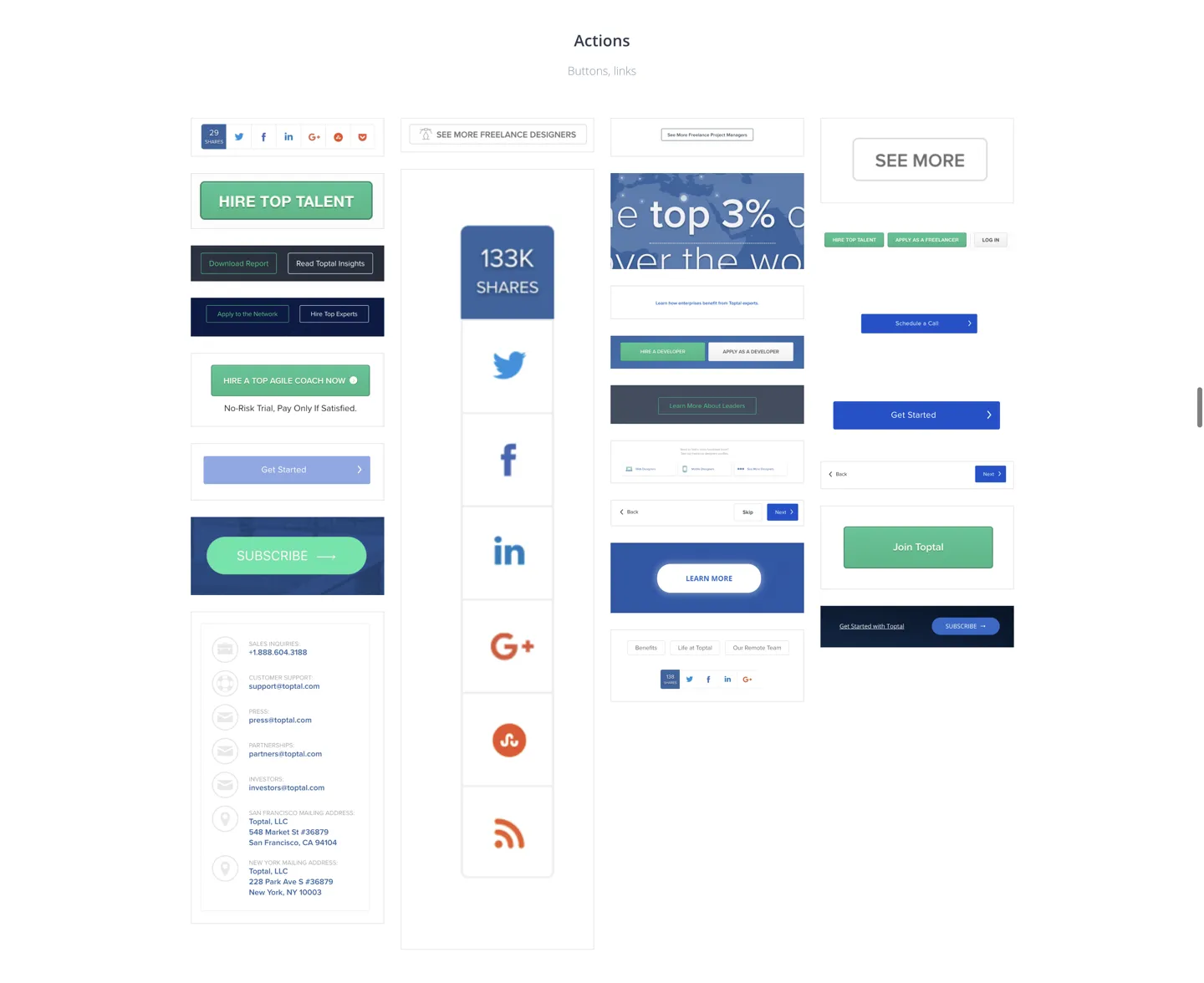
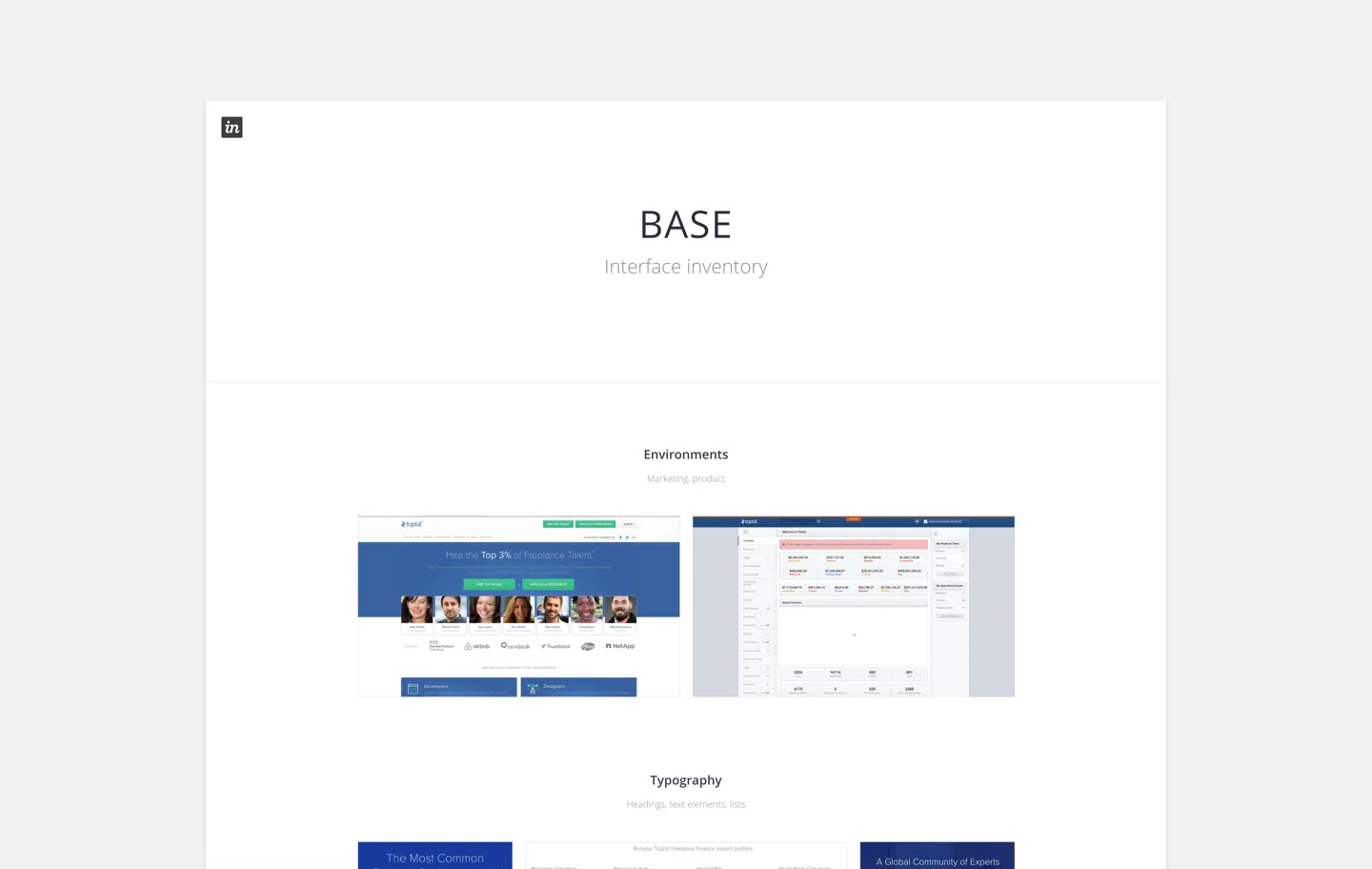
I audited the logged-out marketing pages and the logged-in platform using CSS Stats, screenshots, design files, and prototypes, then organized everything into shared InVision boards. The numbers made the case on their own: more than 10 button styles, 24 font sizes, 14 background colors, 54 text colors, and 8 versions of the logo.
The tradeoff was time before anything new appeared. But the audit turned a debate about taste into a shared list of problems, and it gave the system a clear starting inventory.
Principles
Defining principles with the team before building components
Toptal had no design principles, so I used our weekly design meetings to define them together. What is Toptal’s purpose? What do we prioritize? How do we want users to feel? After a lot of deliberation, we settled on four: Bold, Authentic, Serious, and Energetic.
Then we ran quick, high-level explorations of future directions. Nothing was off the table, and it brought in designers who hadn’t had time to contribute yet.
The tradeoff was a slower start. The payoff showed up later: once BASE was available across Toptal, teams outside design used the principles to make their own hard decisions.
By sharing how we made decisions, we invited other teams to solve problems like designers.
Design and code
Building the system in design and code together
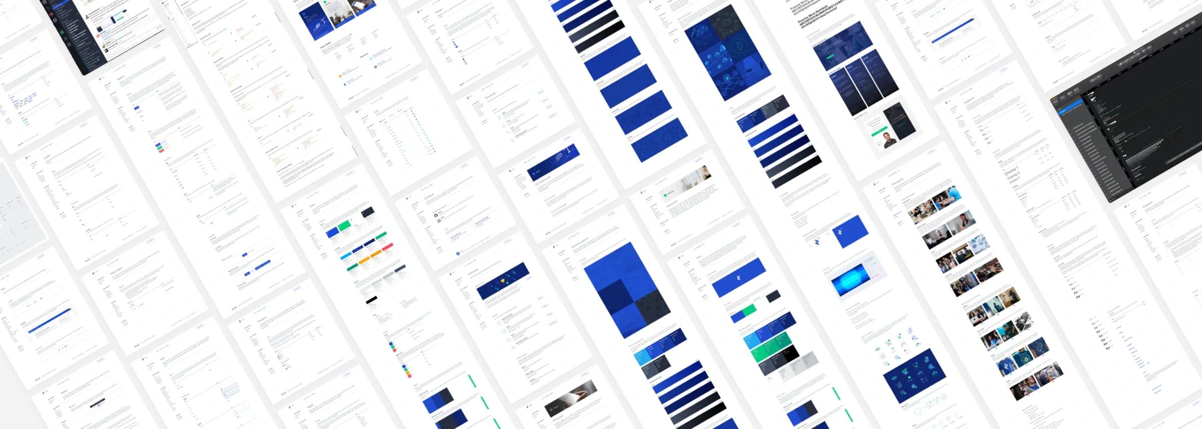
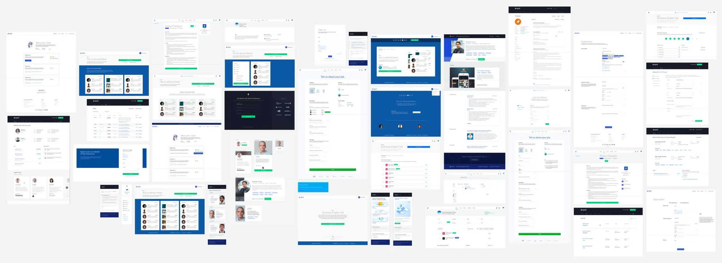
I built components with an Atomic Design approach, starting from core styles and combining them into buttons, avatars, inputs, and larger patterns. A shared Sketch library put them in every designer’s files.
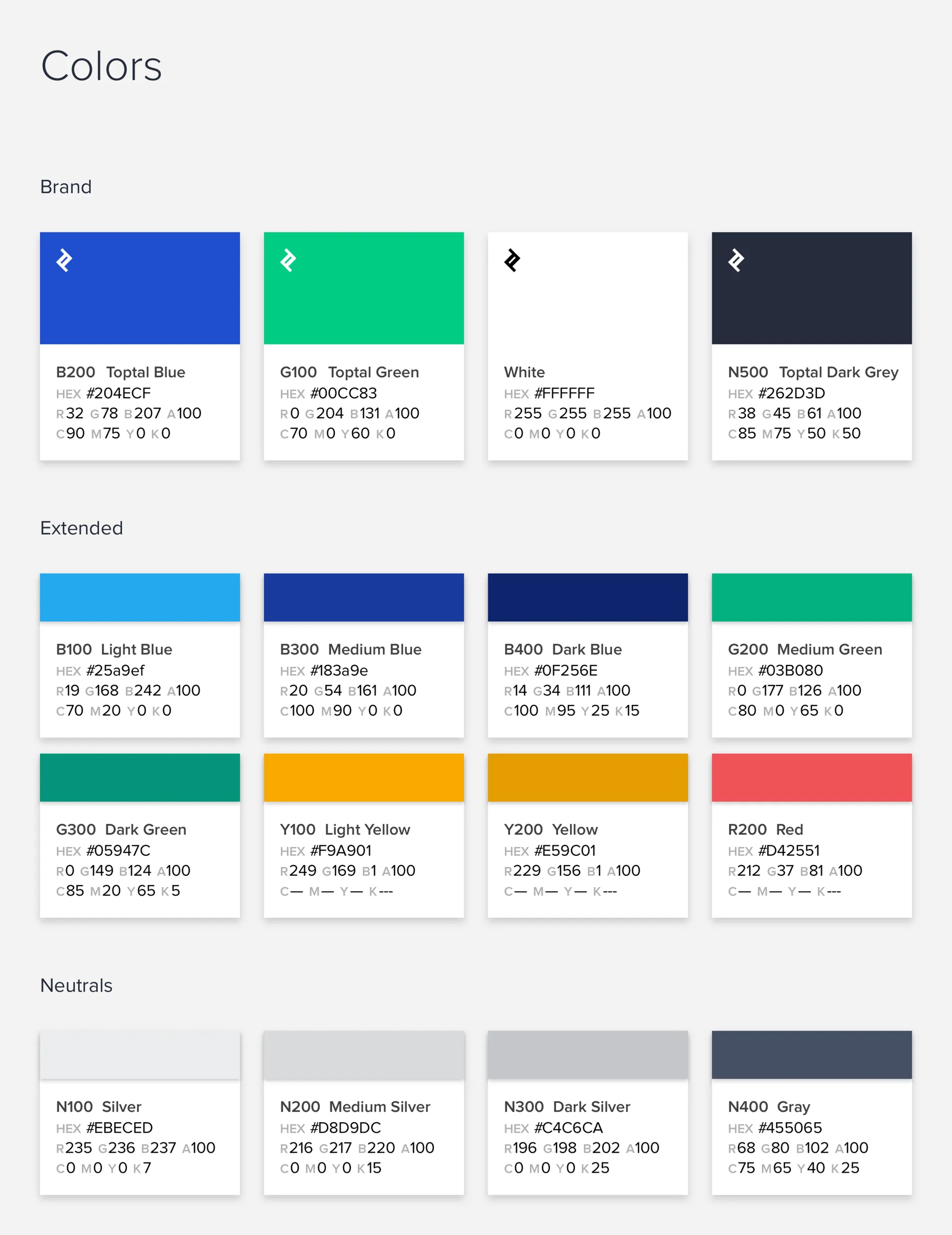
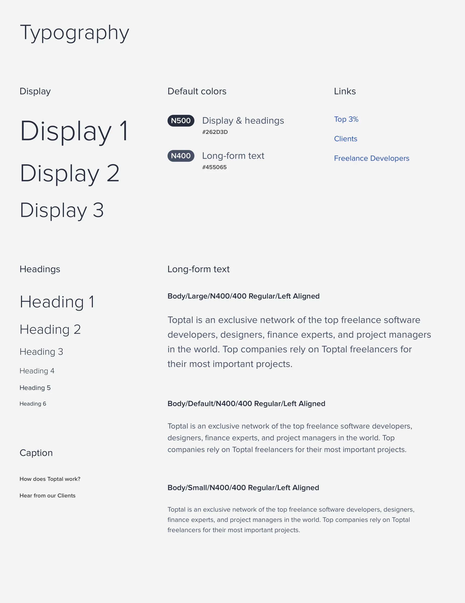
Word got around, and a front-end engineer asked to contribute. We paired Semantic UI with React so product teams could adjust and swap elements. That turned BASE from a design library into a system both design and engineering could build from.
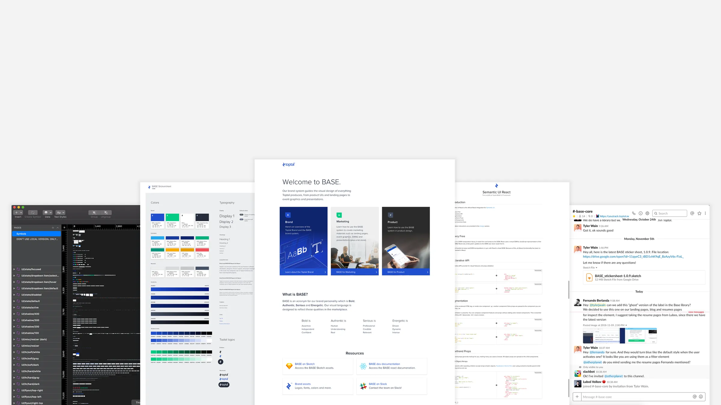
A library alone wasn’t enough, so I wrote the guidance around it: best practices, dos and don’ts, and accessibility guidelines. A documentation site became the single source of truth, with the Sketch library, a sticker sheet, release notes, and implementation notes for developers. An engineer who liked tinkering built BASEbot, a Slack bot that answered common questions like which colors and fonts to use.
More pieces meant more to maintain, but each one removed a reason not to use the system.
BASE turned from a design library into a system both design and engineering could build from.
Outcome
A system Toptal used across design and engineering
- Shipped: a Sketch library and sticker sheet, a React component library, documentation, and a site that served as the single source of truth.
- Faster work: teams built new features by reusing existing components instead of recreating them.
- Beyond design: teams across Toptal used the design principles for their own decisions.
- Better conversations: BASE prompted more discussion of best practices, accessibility, and responsive design.
Looking back
The basics mattered more than more components
Getting teams to adopt BASE took time, because it was a different way of working, not just a redesign. As it matured, the most valuable work wasn’t adding elements. It was returning to fundamentals: accessibility and localization, motion, and a move from Sketch to Figma.