 MicrosoftDynamics 365 Supply Chain Management
Defining Microsoft’s next demand-planning product
Incubating a new demand planning tool
Intelligent Demand Planning started as a small team with one question: should Microsoft build a new demand planning tool? I led design from the first sketches to a Private Preview plan.
The answer was yes, and much of the direction carried into Demand planning in Dynamics 365 Supply Chain Management.
- Role
- Lead and only designer
- Team
- PM, research, engineering
- Timeline
- Jul 2021–early 2022
- Status
- Incubation, then handed off in early 2022
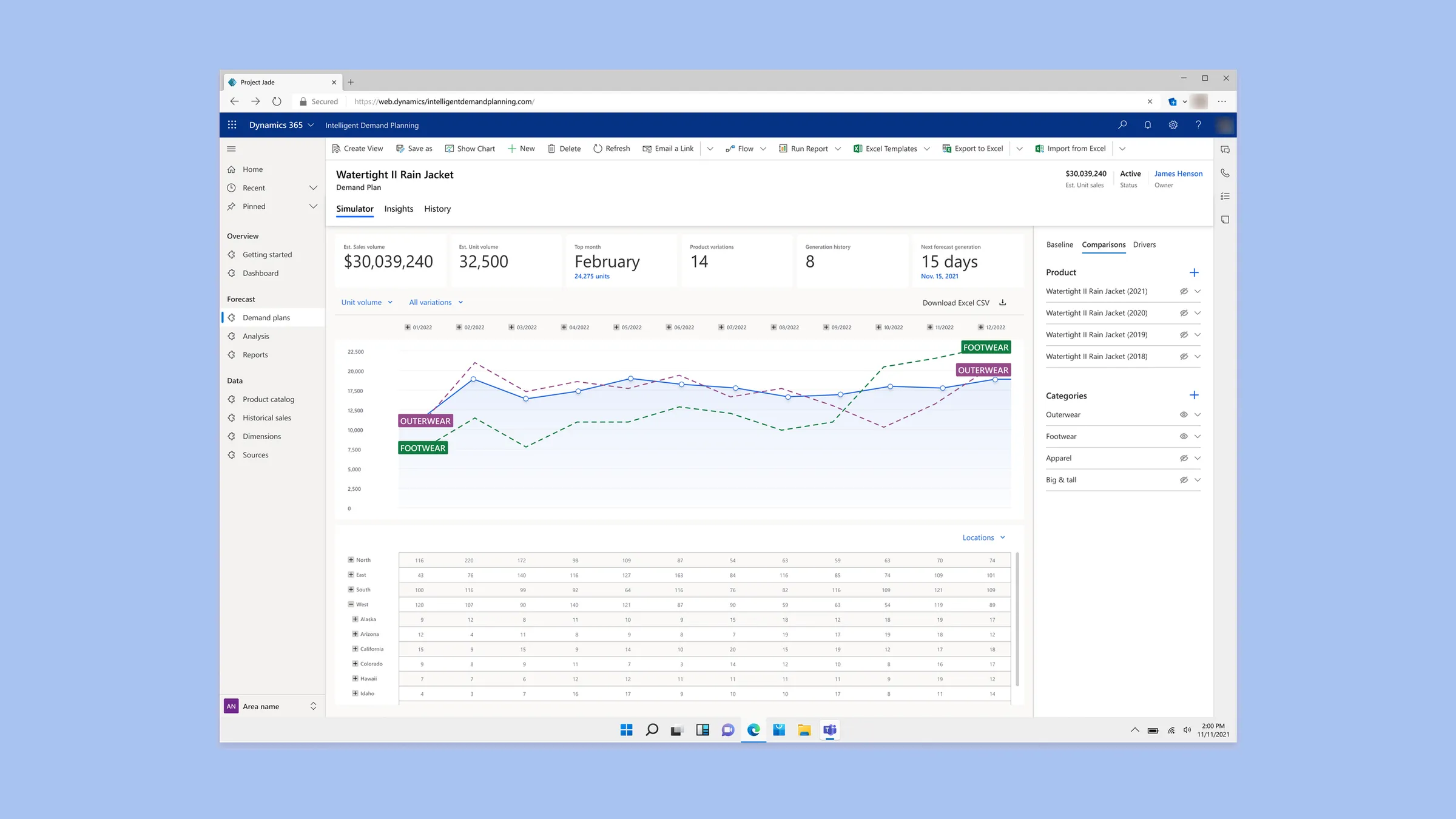
Overview
A blank canvas and a few months to prove it was worth building
Demand planners forecast how much of each product a company will sell, and where. An outside vendor had already run 18 interviews before we started. Our PM and I worked through them, then ran our own round with a wide mix of demand planners. The same picture kept coming up: the work lived in Excel, in huge tables behind formulas, pulled together from systems that didn’t talk to each other.
Demand planning was a known gap in Microsoft’s portfolio. Work had started two years before I joined, but nothing had been built and there was no plan to get there. IDP, code-named Project Jade, was the test of whether it was worth building, with a goal of Private Preview within 12 months. The team was deliberately small: me, a PM, a research lead who built our customer panel, and a few engineers in another time zone.
As the only designer, I owned the whole Private Preview experience: framing, scope, journeys, the core prototype, and the Figma system. I also made the materials the PM and leadership used to pitch it.
“You either under produce or you over produce. Never have I seen that it’s just produced well.”
Framing
Deciding what demand planning owns before designing screens
When I joined, the project lived in a scattered OneNote. There were plenty of ideas and no sense of which mattered most, so scope stayed open and every conversation added to it.
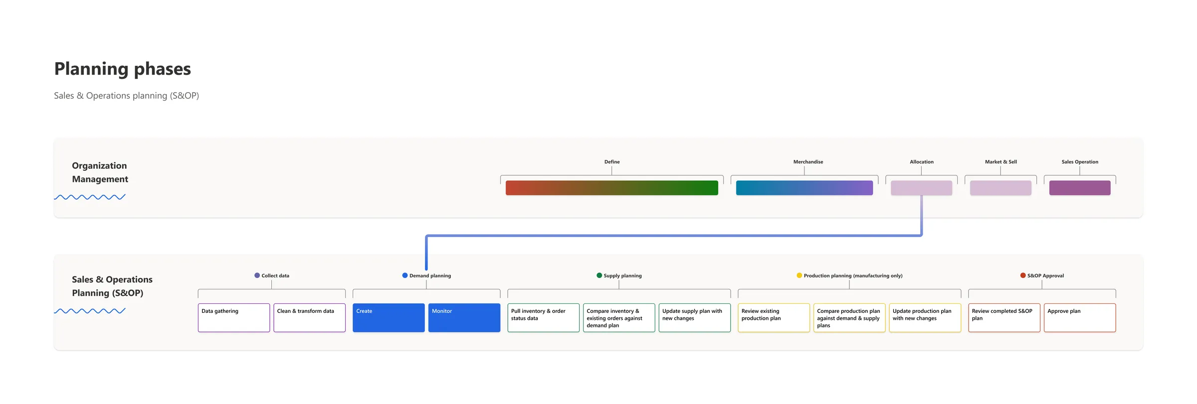
So I started above the product. I mapped the full sales and operations planning cycle, from collecting data through demand, supply, and production planning to final approval, and placed IDP inside it. It was the first time we could see everything in one place, compare it, and truly prioritize. I then broke “create a plan” into the steps a planner takes and wrote prioritized user stories for each, split into MVP and later releases, with every cut tracked. The Figma files followed the same structure: each story got its own row of screens, so PM and engineering could trace any design back to the story it served.
Data came first. I designed a flow that pulled planners’ scattered sources into one product catalog and helped clean up common import errors. I’d built it around connectors, but engineering’s proof of concept used Power Query, so I accepted Power Query to keep the rest of the work moving.
The tradeoff: the early map leaned on unvalidated assumptions. But it locked scope down. Within a few months we had an end-to-end vision leadership bought into and a backlog engineering could start on.
Forecasting
Lining the forecast up with the spreadsheet planners already trusted
Excel was the source of truth, and that wasn’t going to change. A grid of numbers doesn’t show you what a forecast is doing, or what one change does to the rest of the plan.
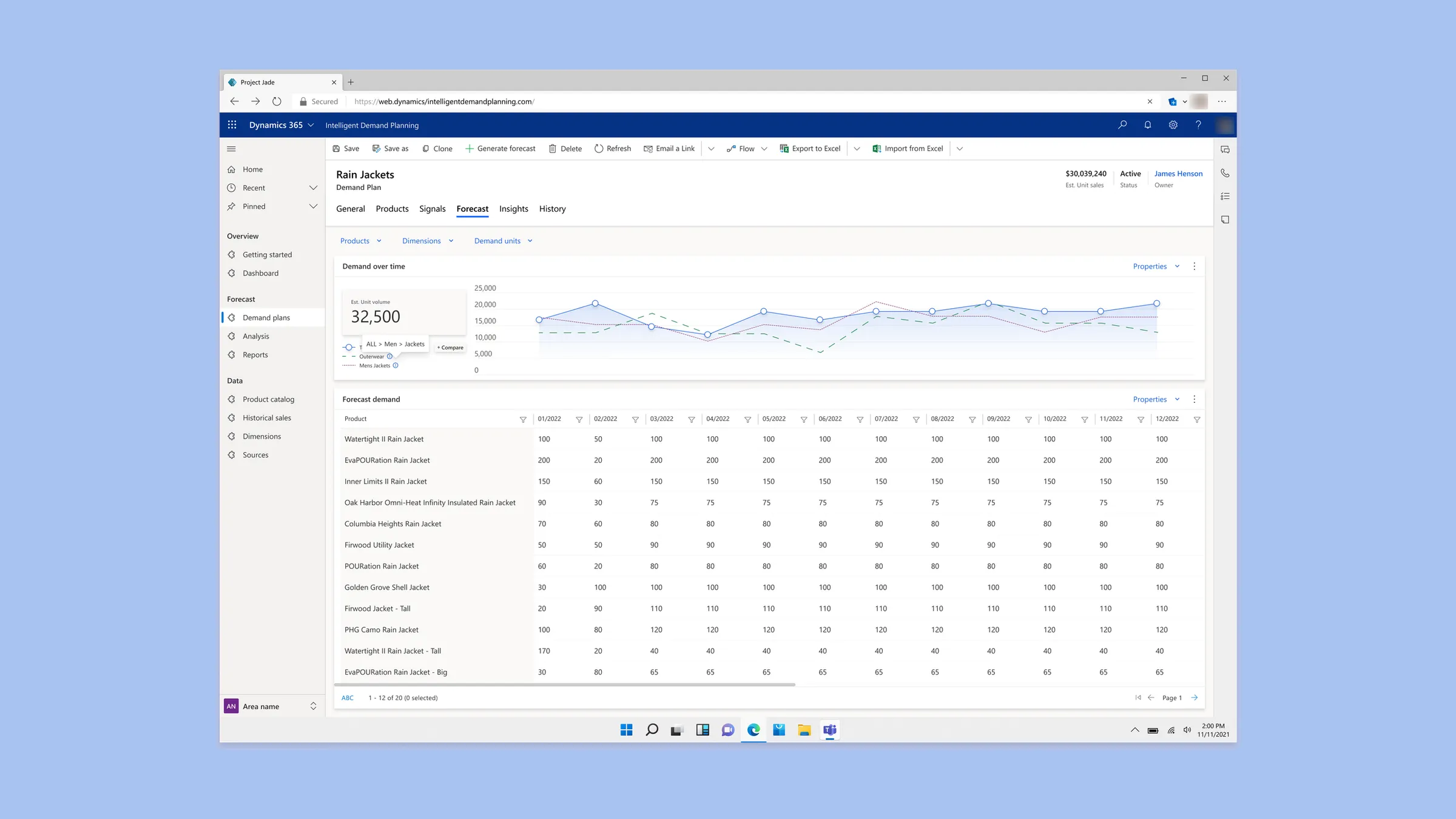
So I kept the table at the center and put the forecast chart directly above it, with the chart’s time periods lined up to the table’s columns. Planners could edit in either place. Drag a point on the chart, and the table highlights exactly which values change underneath, broken down by region or channel. Edit a cell, and the chart moves with it.
Around that, I restructured the information architecture to match how planners work. They could forecast one product, several at once, or a whole category with its products inside it, then switch between dimensions like location and channel, or between demand units.
The simulator added comparison. Planners could overlay past sales for the same product, product group, or category, or compare entire categories, like outerwear against footwear. Hovering a month showed this year against last, with the difference in percent and units.
The tradeoff: keeping the table and chart in sync at every level took far more integration and IA work than a standalone chart. Seeing the forecast move as they edited it got planners more excited than anything else. It improved on the tools our customer panel was using and showed them things they hadn’t known to ask for.
Adjustments
Building in the adjustments planners already made by hand
Planners told us they rarely changed one number in isolation. Raising one month meant deciding what happened to everything around it.
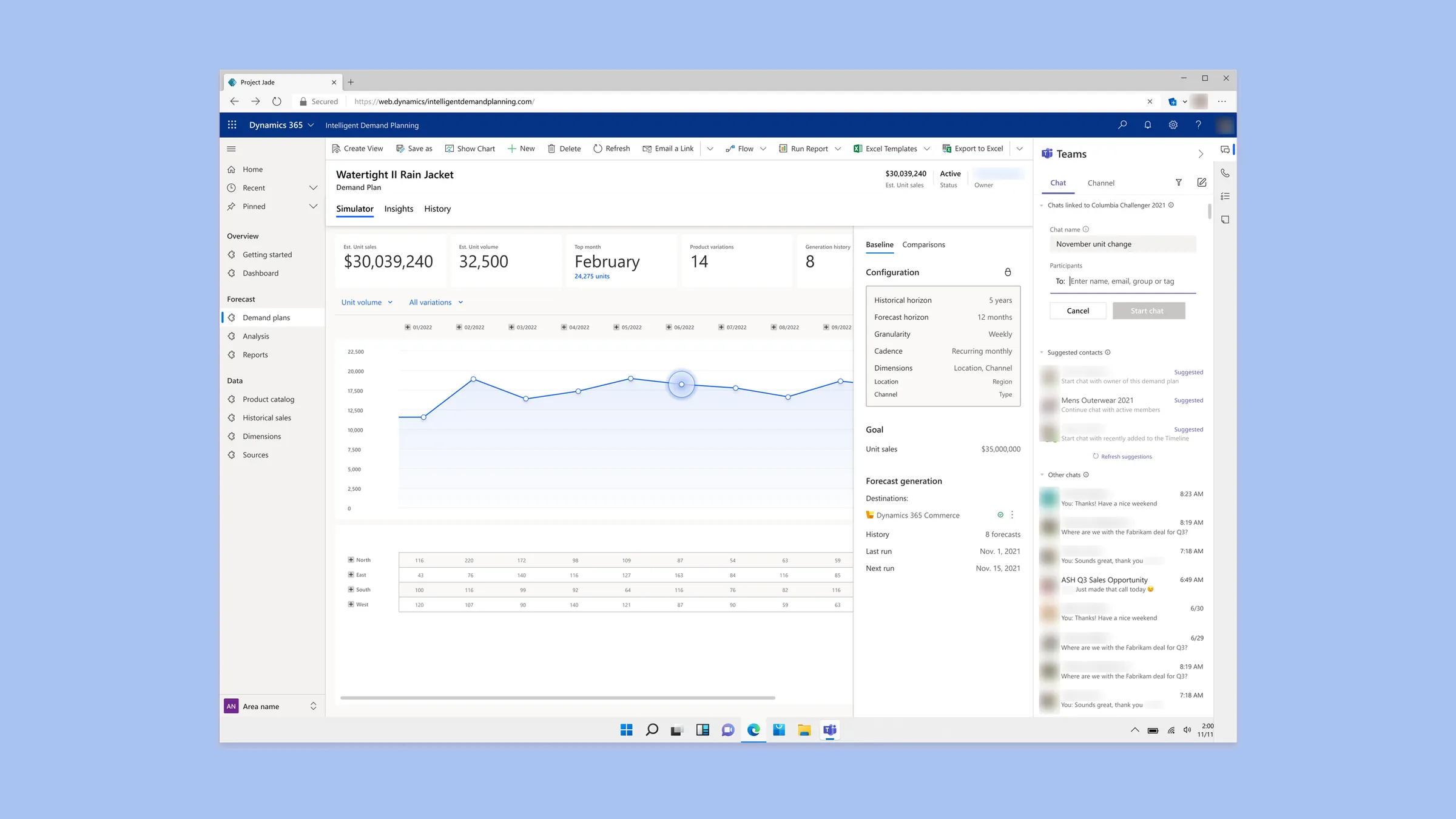
So I built those decisions into the forecast itself. A planner selects a month on the chart and adjusts it by a percentage or a fixed number of units. IDP then asks whether surrounding values should shift relative to that change or stay isolated, and whether it should spread evenly or by weight across regions. Planners can also lock values so other changes flow around them, or scale a change across a range. Saved defaults mean the questions only appear when planners want them.
Scenarios followed the same idea. Our go-to example was planning for the spike when an athlete wears your jacket at the Winter Olympics. Planners could switch scenarios on and off and see every cell they changed.
Adjustments also needed agreement, so I designed IDP’s entry point into Dynamics’ new Teams patterns: select a point on the chart and start a conversation about that exact value, or suggest a change to the plan owner.
The tradeoff was complexity, but every option traced back to something planners told us they did.
Alignment
Making the work easy to understand, pitch, and hand off
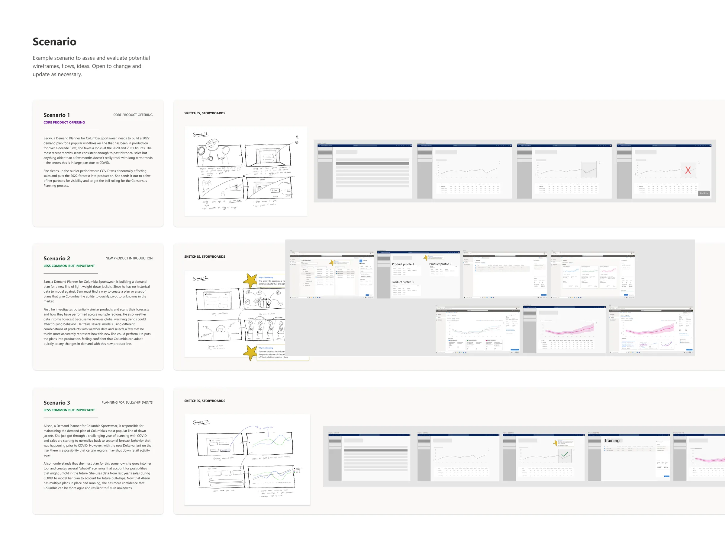
I wrote three scenarios the whole team used to judge ideas: an established product, a new product with no sales history, and sudden swings in demand. I also built the materials that told the story outside the team: a running roadmap for weekly and monthly leadership updates, a ranked view of which problems we were and weren’t solving, and product tours showing leadership and neighboring teams where IDP could plug into supply chain management.
The tradeoff was time: every hour on collateral was an hour not spent on screens. It paid off twice. Leadership saw enough to add PMs and resources. Then, when a reorg in early 2022 moved the project to a new team, I restructured the files and research for fresh eyes and ran the handoff. As IDP moved into Supply Chain Management, it had to fit Dynamics’ rigid internal UI framework, and I helped decide what was worth building from scratch and what could come off the shelf. My manager later wrote that the transition succeeded largely because of the design assets, journey maps, and prototypes I’d created.
Outcome
Leadership invested, and the direction shipped
What I proved and designed
- Leadership decided the space was worth building in and added PMs and engineering.
- My manager later credited the design assets, journey maps, and prototypes for the handoff.
What the later team shipped
- Microsoft announced the public preview of Demand planning in Dynamics 365 Supply Chain Management in October 2023. The look changed to fit that product, and much of the direction carried through.
Looking back
Set a baseline before the first test
We had a customer panel but no benchmark tasks to measure against, so some early assumptions went untested longer than they should have. Next time I’d define the core tasks up front and test against them from the start.