 ToptalTalent onboarding
Rethinking a 3.5-month onboarding flow
Why so many applicants never finished
Toptal’s talent onboarding took applicants anywhere from three weeks to five months, averaging nearly three and a half. Many never finished.
Soon after joining the team, I worked with a small group to find out why, then redesigned the flow around what applicants actually needed.
- Role
- Senior UX designer
- Team
- Shared researcher, engineering, and operations partners
- Timeline
- 2018, remote, alongside Dell (2017–2019)
- Status
- Shipped
Overview
Why so many applicants never finished
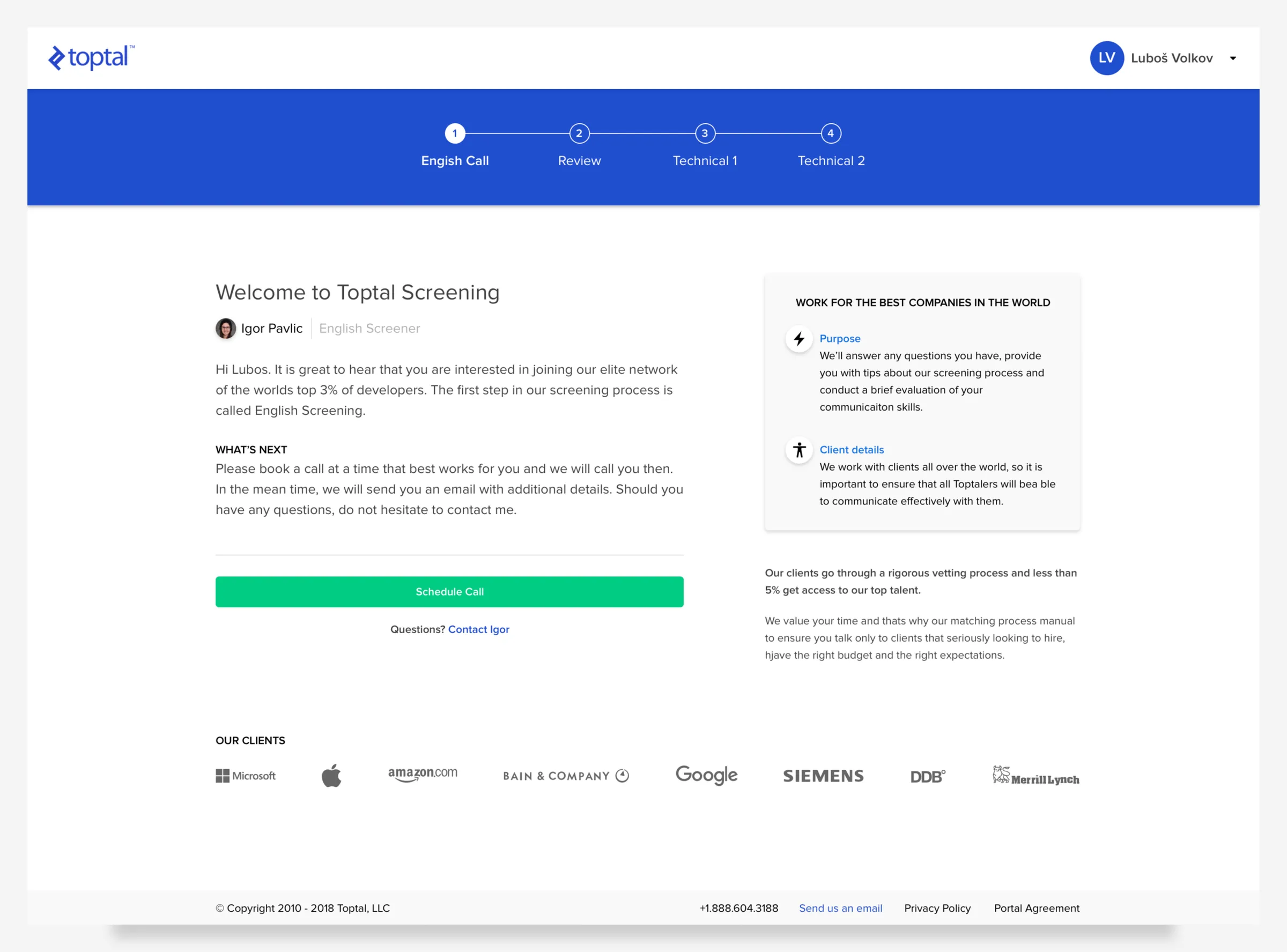
Toptal is a freelance network that connects engineers and designers with companies. Before talent can take on client work, they go through onboarding: screening calls, forms, a portfolio review, technical interviews, and a test project. When I looked, that took anywhere from three weeks to five months, averaging nearly three and a half.
So many applicants didn’t finish. I joined as the team’s second UX designer and picked this up as one of my first projects, working with a small team to find out why and to design something better.
I did the UX and UI design for the new flow, and worked with a researcher who was shared across the whole design team.
Research
Going through the process myself
I didn’t have the product background others on the team had, so I started by learning the process firsthand. I asked to sit in on every onboarding step that involved Toptal staff: the English call, both technical interviews, the portfolio review, and the development test. I also went through onboarding myself, repeatedly, to experience each situation applicants ran into.
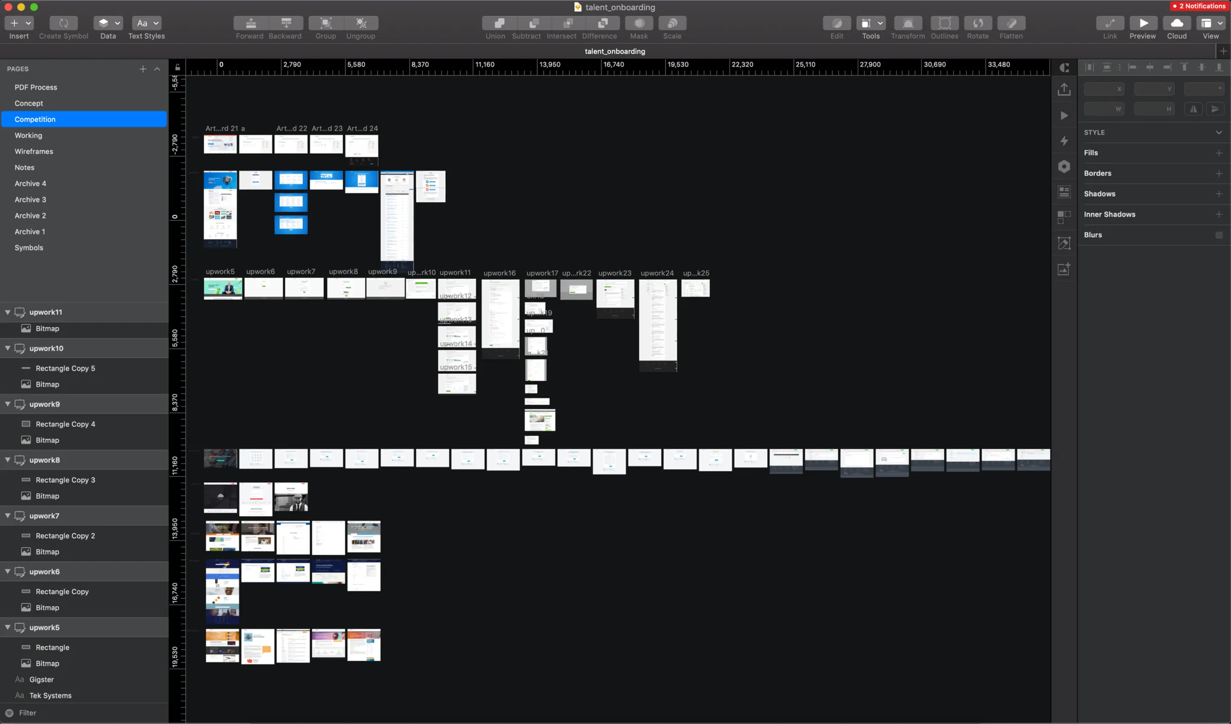
Then I signed up with the competitors applicants had told us they turned to instead of Toptal, across several talent groups. I compared how easy each was, what it required, how much it made me trust the company, how long it took, and how many steps it involved.
The pattern was clear. The flow had been built for the ease of back-end development, at the expense of the applicant. Applicants answered dozens of questions, some of them more than once, and completed technical interviews and a test project.
The tradeoff was patience. I didn’t draw a screen until I understood why the flow looked the way it did.

Friction
Counting the friction, and naming its cause
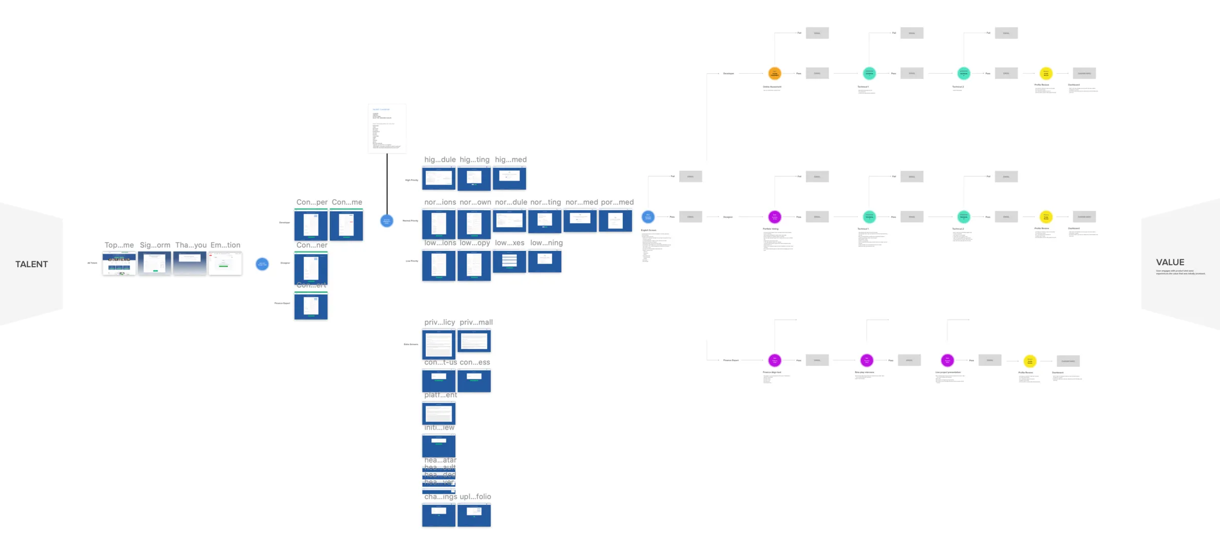
To make the problem visible, I mapped the two main paths applicants took. Toptal’s system sorted them into high, normal, and low priority flows with a 16-question classifier. Even the best case, the low-friction flow, took 8 screens, 7 emails, 27 form fields, and 4 phone calls. The high-friction flow, for “normal” priority applicants, took 9 screens, 7 emails, 38 form fields, and the same 4 calls. Applicants on that path were far more likely to give up, usually around seven weeks after applying.
The biggest pain points were the classifier, the English screener (a required call whose main purpose was never explained to applicants), portfolio voting, and the technical interviews.
The friction wasn’t purposeful. Toptal had grown quickly without enough UX involvement. So before reworking the whole journey, we encouraged engineering to take some immediate steps we believed would produce easy wins. The tradeoff was patience again: easy wins first, the full redesign second.
The friction wasn’t purposeful. Toptal had simply grown too quickly without enough UX involvement.

Redesign
Letting applicants finish in any order
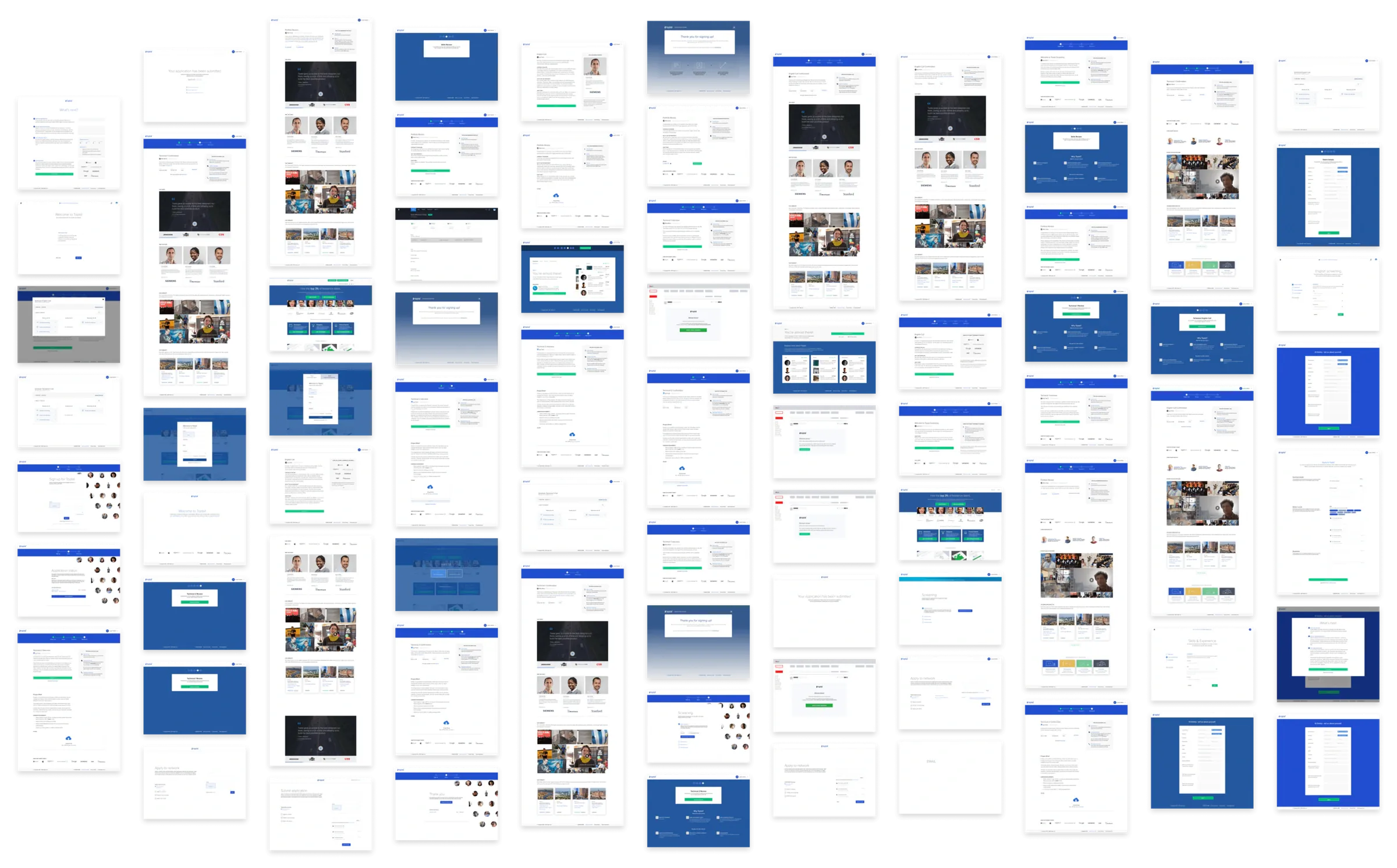
With the information we actually needed defined, I explored different ways to group the questions and tested dozens of layouts. This overlapped with BASE, so I could swap components and patterns quickly. I took the directions back to internal operations staff and recently hired talent for feedback.
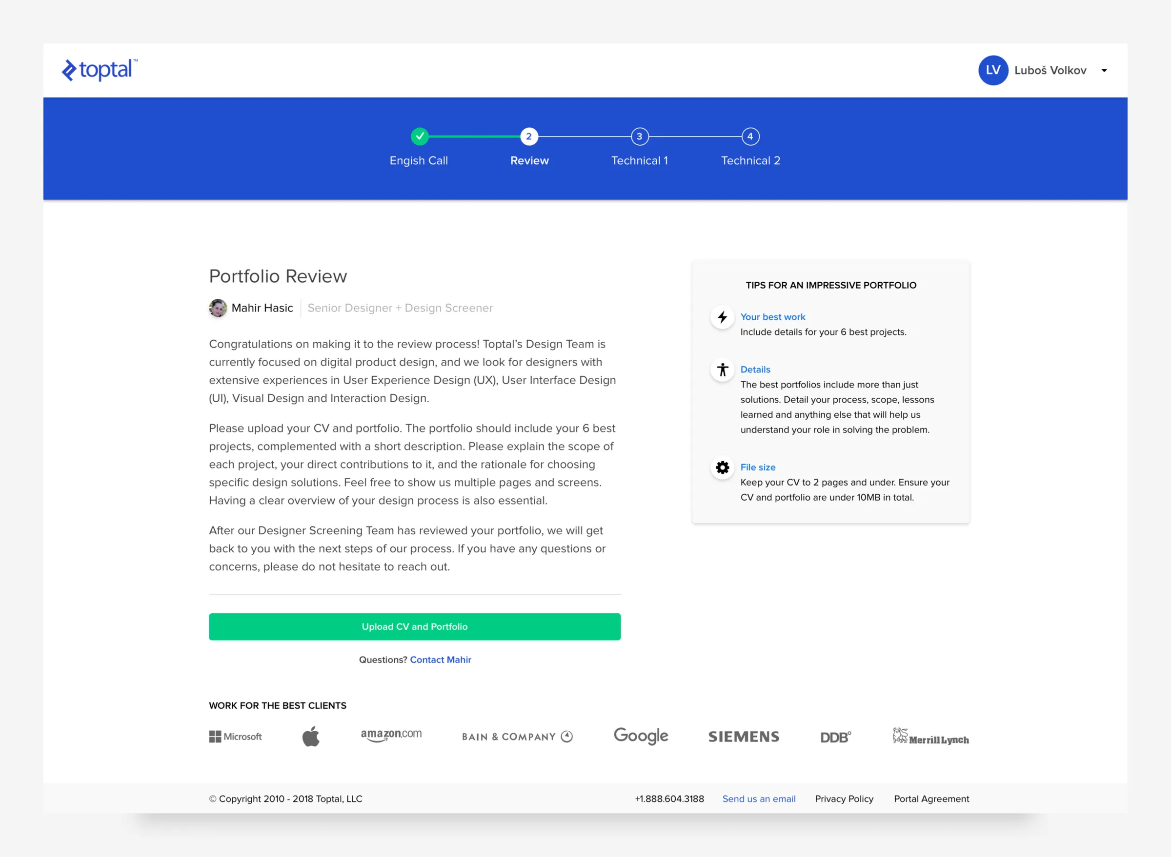
The final design made it clear what was expected at every point. Applicants could fill out forms in any order and come back later. Before, it wasn’t obvious whether their work had been saved. Instead of involving a screener at four different points, I proposed combining the calls into a single step, and the designs dropped optional fields and unnecessary emails. There were also small moments to learn about Toptal along the way, without being heavy-handed.
The old flow put back-end convenience first. The redesign put the applicant first, and that meant asking engineering to accept some change.
Outcome
A simpler flow that shipped in 2018
- Shipped: the redesigned onboarding flow shipped in 2018.
- The design: applicants could fill out forms in any order and return to them later, and the screener calls were combined into a single step.
- Fewer steps: optional form fields and unnecessary emails were dropped from the design.
- Operations: internal operations staff liked the direction, since it meant less time tracking down leads stuck for unknown reasons.
- Handoff: I walked the designer who continued the work through what I’d started.
Looking back
Advocating for applicants at a pace engineering could accept
This project taught me to be an advocate for the end user while staying aware of the team that has to build the change. The engineers I worked with were excited to make improvements, but they were wary of change, so I paced my suggestions and later designs to match.